Payment Page Designer
Learn how to change the design of the payment page.
Before you begin
Before you begin, you should check out the default values for the standard payment page.
Design options
You can easily change the design of the payment page with the built-in payment page designer.
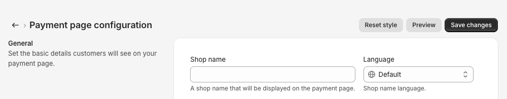
Go to Settings > Payments.
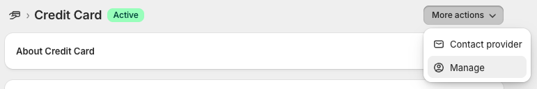
Select an app that uses Payment Page, see complete list.
Select Manage in the top right corner.
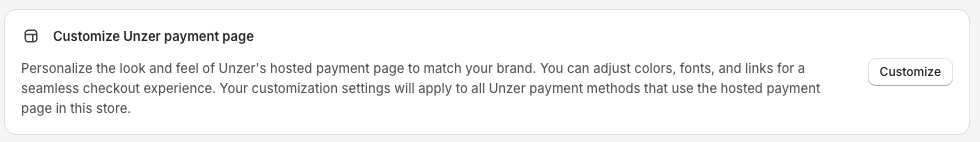
Scroll to the bottom of the page and click Customize
Before saving and releasing new changes, we recommend you check your changes with the Preview button.
Click Save changes to release your design changes.
You can easily reset your changes, just click Reset style at the top.
Please see the table below for explanations to each field or checkmark in the payment page designer.
| Parameter | Description |
|---|---|
| Shop name | Will display a shop name in the payment page. |
| Language | If you have created more language in Shopify, you can define different Shop name for each language. |
| Brand logo | Will show the given logo image in the top left of the payment page. The following formats are supported: jpg, svg and png. |
| Background image | Will render the given image in the background of the payment page. The following formats are supported: jpg and png. |
| Favicon | URL to your favicon file. Supported formats: ico, gif, png. |
| Hide Unzer logo | Show/hide “Secure checkout” instead of “Secure checkout by Unzer” in the bottom right corner of the payment page. |
| Enable shadows | Enable/disable shadows. |
| Help URL | URL for Help link in header section. |
| Contact URL | URL for Contact link in header section. |
| Terms and Conditions URL | URL for Terms and Conditions link in footer section. |
| Privacy Policy URL | URL for Privacy Policy link in footer section. |
| Imprint URL | URL for Imprint link in footer section. |
| Subscription agreement URL | URL for Subscription agreement page. |
| Font family | The font to be used throughout the Payment Page. |
| Header color | Changes the header color to the given value. |
| Footer color | Changes the footer color to the given value. |
| Text color | The color of text, icons and borders on the page. |
| Link color | This will affect the link color and the inverse link color. |
| Brand color | The color to be used as base color, such as the button color. Other colors will be derived from this color. For example, interactive state colors such as hover, focus and pressed, selected, loader and component colors. |
| Background color | The background color of the payment page. |
| Payment form background color | The color for the payment form background. |
| Corner radius | The corner radius of elements in pixels. |
Preview and reset changes
Before you save and release your changes, always use the preview option. Click Preview to review your changes.
If you want to reset all changes, simply click Reset style.