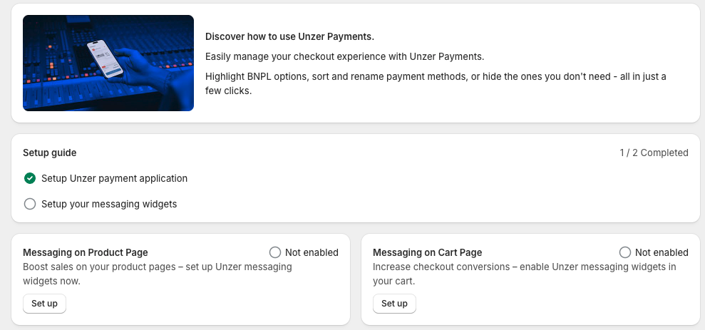
Widget setup
Set up widgets and change the design to match your preferences.

- Market created with region(s) Germany and/or Austria must be selected in the Theme Editor
- Cart total must exceed your Installment agreement minimum
- Currency must be EUR
- Online Store 2.0 theme active
- Unzer test key pair available
Choose widget
First, you must choose if you want to set up widgets on product pages or cart pages. Choose one of the two options to continue.
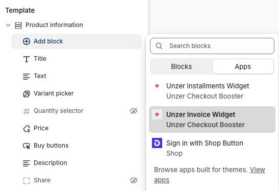
Insert widgets on product pages
In the Theme Editor, click on any product to access product details. Then in the left menu locate the Template section and click Add block > Apps > Choose Invoice and/or Installment to place it on the product page. Repeat to install both apps.
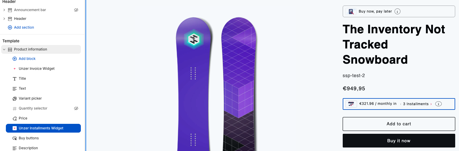
Place widget on product pages
To place the widget where you want it, simply drag and drop the widget in the Template section in the left menu.
Change cart layout
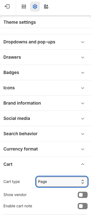
In order to show widgets in the cart, first you must change the cart layout.
In the Theme Editor, click Theme settings > Cart > Change Cart type to Page. Click Save.
Before you can see the widgets, you must have items or products in your cart.
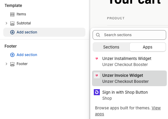
Insert widgets on cart page
In the Theme Editor, add one or more products to the cart and go to the cart page. Then in the left menu locate the Template section and click Add block > Apps > Choose Invoice and/or Installment to place it on the cart page. Repeat to install both apps.
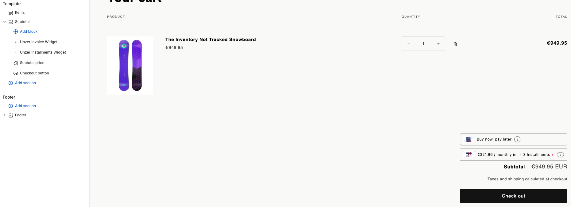
Place widget on cart page
To place the widget where you want it, simply drag and drop the widget in the Template section in the left menu.
Design Invoice widget
Click on the Invoice widget to open the design menu. The design settings panel is on the right side of the Theme Editor.
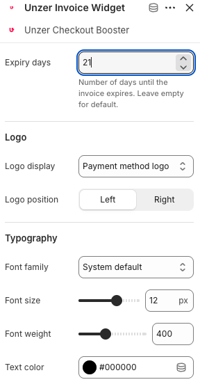
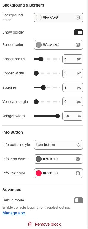
See the table below for explanations of each field or checkmark in the design settings panel.
| Field name | Description |
|---|---|
| Expiry days | Number of days until the invoice expires. Leave empty to use the default value. |
| Logo display | Sets which logo is shown on the widget. Select Payment method logo to display the logo of the selected payment method. |
| Logo position | Sets the horizontal alignment of the logo. Select Left or Right. |
| Font family | Sets the font used in the widget. Select System default to inherit the font from the merchant’s storefront theme. |
| Font size | Sets the font size in pixels. |
| Font weight | Sets the font weight. A value of 400 is regular; 700 is bold. |
| Text color | Sets the text color. Enter a hex color code or use the color picker. |
| Field name | Description |
|---|---|
| Background color | Sets the background color of the widget. Enter a hex color code or use the color picker. |
| Show border | Enables or disables a border around the widget. |
| Border color | Sets the color of the widget border. Enter a hex color code or use the color picker. |
| Border radius | Sets the corner radius of the widget border in pixels. |
| Border width | Sets the thickness of the widget border in pixels. |
| Spacing | Sets the inner padding of the widget in pixels. |
| Vertical margin | Sets the vertical margin above and below the widget in pixels. |
| Widget width | Sets the width of the widget as a percentage of the available space. |
| Info button style | Sets the style of the info button. Select Icon button to display an icon, or choose an alternative style from the dropdown. |
| Info icon color | Sets the color of the info icon. Enter a hex color code or use the color picker. |
| Info link color | Sets the color of the info link text. Enter a hex color code or use the color picker. |
| Debug mode | Enables console logging for troubleshooting purposes. |
Design Installment widget
Click on the Installment widget to open the design menu. The design settings panel is on the right side of the Theme Editor.
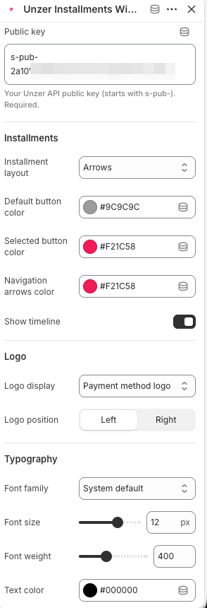
See the table below for explanations of each field or checkmark in the design settings panel.
| Field name | Description |
|---|---|
| Public key | Your Unzer API public key (starts with s-pub-). Required. |
| Installment layout | Sets the layout style for the installment plan selector. Select Arrows to use an arrow-based navigation, or choose an alternative layout from the dropdown. |
| Default button color | Sets the color of unselected installment plan buttons. Enter a hex color code or use the color picker. |
| Selected button color | Sets the color of the currently selected installment plan button. Enter a hex color code or use the color picker. |
| Navigation arrows color | Sets the color of the navigation arrows in the installment layout. Enter a hex color code or use the color picker. |
| Show timeline | Enables or disables a visual payment timeline within the widget. |
| Logo display | Sets which logo is shown on the widget. Select Payment method logo to display the logo of the selected payment method. |
| Logo position | Sets the horizontal alignment of the logo. Select Left or Right. |
| Font family | Sets the font used in the widget. Select System default to inherit the font from the merchant’s storefront theme. |
| Font size | Sets the font size in pixels. |
| Font weight | Sets the font weight. A value of 400 is regular; 700 is bold. |
| Text color | Sets the text color. Enter a hex color code or use the color picker. |
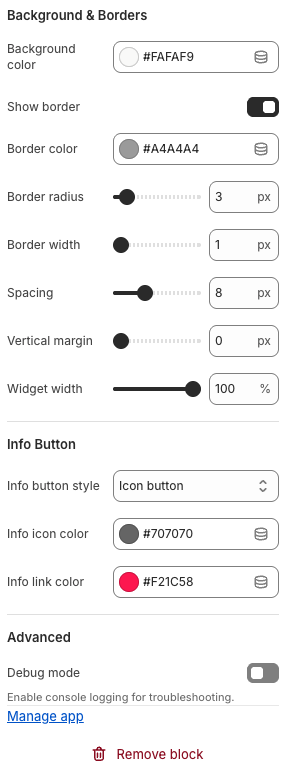
| Field name | Description |
|---|---|
| Background color | Sets the background color of the widget. Enter a hex color code or use the color picker. |
| Show border | Enables or disables a border around the widget. |
| Border color | Sets the color of the widget border. Enter a hex color code or use the color picker. |
| Border radius | Sets the corner radius of the widget border in pixels. |
| Border width | Sets the thickness of the widget border in pixels. |
| Spacing | Sets the inner padding of the widget in pixels. |
| Vertical margin | Sets the vertical margin above and below the widget in pixels. |
| Widget width | Sets the width of the widget as a percentage of the available space. |
| Info button style | Sets the style of the info button. Select Icon button to display an icon, or choose an alternative style from the dropdown. |
| Info icon color | Sets the color of the info icon. Enter a hex color code or use the color picker. |
| Info link color | Sets the color of the info link text. Enter a hex color code or use the color picker. |
| Debug mode | Enables console logging for troubleshooting purposes. |